Color Chronicles: Adding Depth and Dimension to your Macrame Projects

Color Chronicles: Adding Depth and Dimension to your Macrame Projects
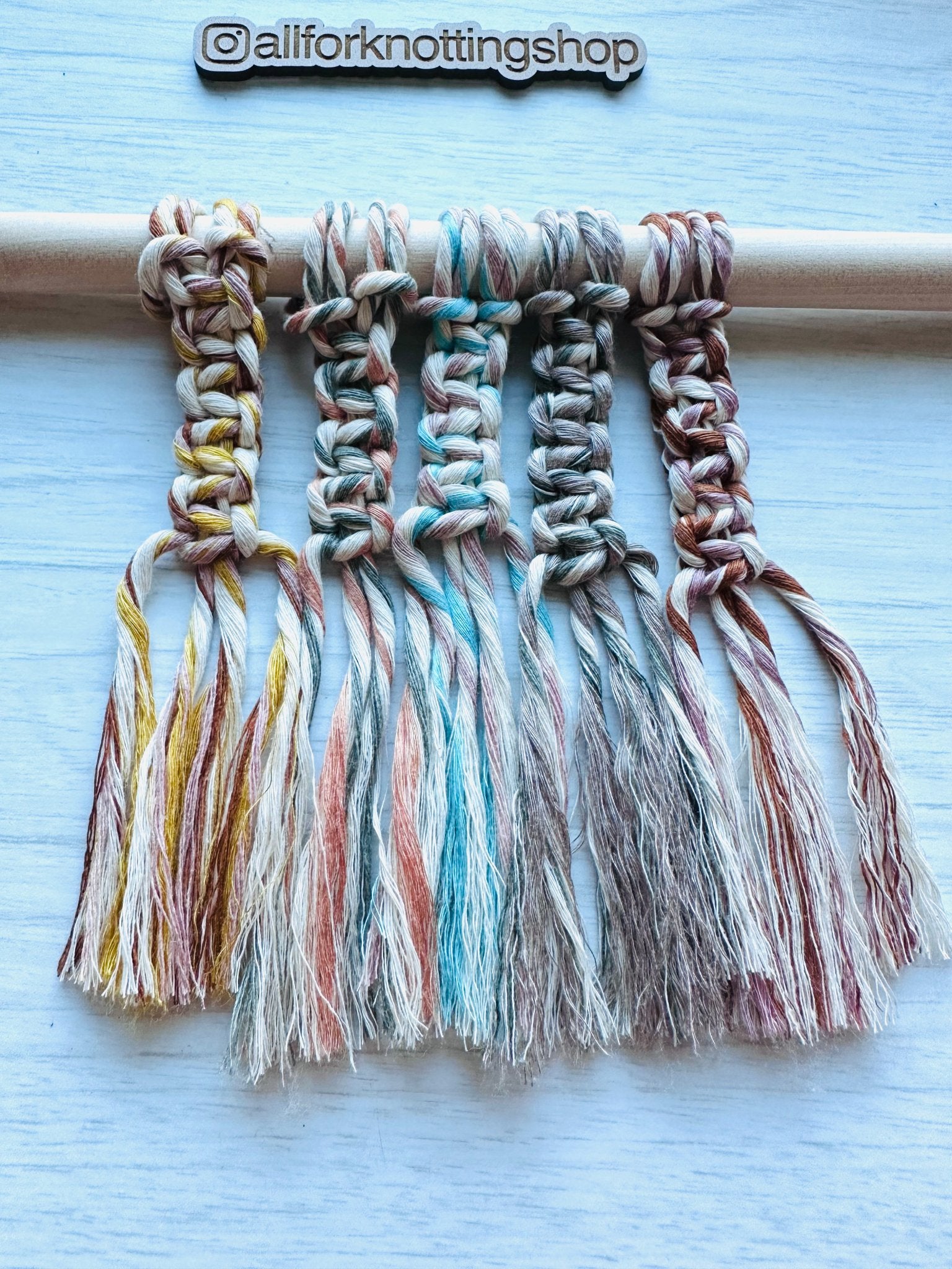
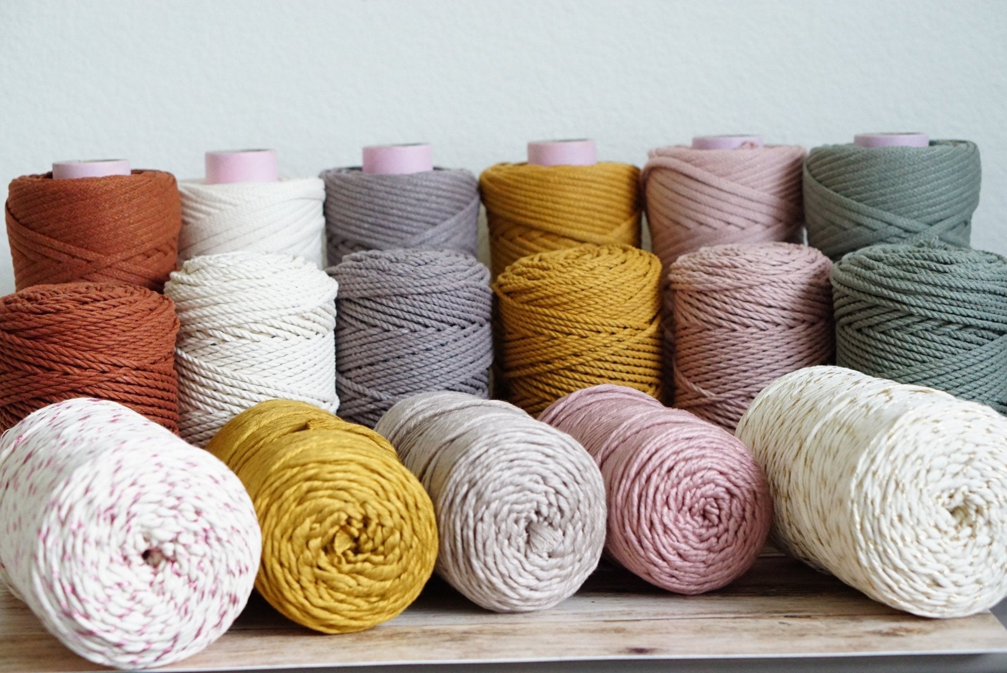
The color of your macramé cord is a powerful design element that can transform the mood, style, and visual impact of your project. Understanding how to navigate the color palette opens up endless creative possibilities. Let's explore the fascinating world of color in macramé:
-
Earth Tones:
-
Characteristics:
- Browns, greens, and neutrals.
- Adds a grounded and natural aesthetic.
-
Best Uses:
- Perfect for bohemian or rustic designs.
- Creates a harmonious connection with nature-inspired projects.
-
Characteristics:
-
Pastels:
-
Characteristics:
- Soft shades like blush, mint, and baby blue.
- Infuses a gentle and calming vibe.
-
Best Uses:
- Ideal for nursery décor, dreamcatchers, or projects with a delicate and serene feel.
-
Characteristics:
-
Bold and Vibrant Hues:
-
Characteristics:
- Reds, blues, yellows, and other intense colors.
- Adds energy and a pop of excitement.
-
Best Uses:
- Perfect for statement pieces or projects that demand attention.
- Injects a lively and dynamic element into your macramé.
-
Characteristics:
-
Monochromatic Schemes:
-
Characteristics:
- Sticking to a single color or shades of the same color.
- Creates a sophisticated and cohesive look.
-
Best Uses:
- Ideal for modern or minimalist designs.
- Allows the focus to be on the form and structure of your knots.
-
Characteristics:
-
Gradient and Ombre Effects:
-
Characteristics:
- Transitioning from one color to another.
- Adds depth and dimension to your project.
-
Best Uses:
- Perfect for wall hangings, curtains, or projects where a gradient effect enhances the overall design.
-
Characteristics:
Considerations When Choosing Colors:
-
Project Purpose:
- Consider the intended purpose of your macramé piece. Earthy tones for décor, pastels for baby items, bold hues for statement pieces, and gradients for artistic flair.
-
Room Aesthetics:
- Align the color palette with the existing décor of the space where your macramé will be displayed. Create a cohesive and harmonious environment.
-
Personal Style:
- Express your personal style through color choices. Whether you prefer muted tones or vibrant contrasts, let your color selection reflect your aesthetic preferences.
-
Seasonal Inspiration:
- Draw inspiration from the seasons. Light and airy colors for spring, warm and earthy tones for fall, or cool blues for a beachy summer vibe.
Tips for Colorful Success:
- Experiment with color combinations to find your unique palette.
- Use neutral cords as a base and incorporate pops of color for a balanced look.
- Don't be afraid to mix and match different colors and textures for added visual interest.
The color choices in macramé are a painter's palette for your knots. Whether you're creating a calming oasis or a vibrant statement piece, understanding the language of color allows you to weave stories and emotions into your macramé creations. Happy knotting with a splash of color! 🎨🧵✨


Comments